githaven/web_src
wxiaoguang 7a6260f889
Improve repo search UI (#29767)
1. Introduce a special "flex-items-block" for menu items, to align the
dropdown menu items
2. Simplify the "repo search" form
3. Add missing "TopicOnly" search option

Screenshots:

The old UI items don't align:

<details>
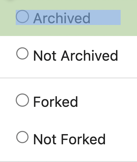
![image](https://github.com/go-gitea/gitea/assets/2114189/b965ac00-bad6-4d2f-9103-8841bd940aa5)

</details>


New UI (doesn't change much, but the items align)

<details>

![image](https://github.com/go-gitea/gitea/assets/2114189/a1add892-21dc-423b-90d5-5569faa3dced)


![image](https://github.com/go-gitea/gitea/assets/2114189/fb4040b2-96d8-4fb2-a0ed-760b9881fd86)

</details>

---------

Co-authored-by: silverwind <me@silverwind.io>
2024-03-15 09:45:30 +00:00
..
css Improve repo search UI (#29767) 2024-03-15 09:45:30 +00:00
fomantic Regenerate fomantic lockfile and build it with our browserslist (#29560) 2024-03-04 21:24:12 +01:00
js Use Temporal.PlainDate for absolute dates (#29804) 2024-03-15 09:13:01 +00:00
svg Update various logos and unify their filenames (#29637) 2024-03-06 22:20:05 +00:00