Nanguan Lin
db545b208b
Implement actions badge svgs ( #28102 )
...
replace #27187
close #23688
The badge has two parts: label(workflow name) and message(action
status). 5 colors are provided with 7 statuses.
Color mapping:
```go
var statusColorMap = map[actions_model.Status]string{
actions_model.StatusSuccess: "#4c1", // Green
actions_model.StatusSkipped: "#dfb317", // Yellow
actions_model.StatusUnknown: "#97ca00", // Light Green
actions_model.StatusFailure: "#e05d44", // Red
actions_model.StatusCancelled: "#fe7d37", // Orange
actions_model.StatusWaiting: "#dfb317", // Yellow
actions_model.StatusRunning: "#dfb317", // Yellow
actions_model.StatusBlocked: "#dfb317", // Yellow
}
```
preview:


---------
Co-authored-by: Lunny Xiao <xiaolunwen@gmail.com>
Co-authored-by: Giteabot <teabot@gitea.io>
Co-authored-by: delvh <dev.lh@web.de>
2024-02-27 18:56:18 +01:00
wxiaoguang
d2f6588b66
Remove incorrect and unnecessary Escape from templates ( #29394 )
...
Follow #29165

* some of them are incorrect, which would lead to double escaping (eg:
`(print (Escape $.RepoLink)`)
* other of them are not necessary, because `Tr` handles strings&HTML
automatically

Suggest to review by "unified view":
https://github.com/go-gitea/gitea/pull/29394/files?diff=unified&w=0
2024-02-25 14:02:20 +00:00
wxiaoguang
7a1557d2cc
Remove unnecessary "Safe" modifier from templates ( #29318 )
...
Follow #29165
2024-02-22 17:02:33 +00:00
wxiaoguang
31bb9f3247
Refactor more code in templates ( #29236 )
...
Follow #29165 .
* Introduce JSONTemplate to help to render JSON templates
* Introduce JSEscapeSafe for templates. Now only use `{{ ... |
JSEscape}}` instead of `{{ ... | JSEscape | Safe}}`
* Simplify "UserLocationMapURL" useage
2024-02-18 10:52:02 +01:00
Tim-Nicas Oelschläger
374e886f51
Change webhook-type in create-view ( #29114 )
...
It's now possible to change webhook-type in create-view.
before:

after:

---------
Co-authored-by: silverwind <me@silverwind.io>
Co-authored-by: Giteabot <teabot@gitea.io>
2024-02-15 14:59:48 +01:00
Yarden Shoham
3e8414179c
Introduce htmx and use it to avoid full page load on Subscribe and Follow ( #28908 )
...
- Closes https://github.com/go-gitea/gitea/issues/28880
This change introduces htmx with the hope we could use it to make Gitea
more reactive while keeping our "HTML rendered on the server" approach.
- Add `htmx.js` that imports `htmx.org` and initializes error toasts
- Place `hx-headers='{"x-csrf-token": "{{.CsrfToken}}"}'` on the
`<body>` tag so every request that htmx sends is authenticated
- Place `hx-swap="outerHTML"` on the `<body>` tag so the response of
each htmx request replaces the tag it targets (as opposed to its inner
content)
- Place `hx-push-url="false"` on the `<body>` tag so no changes to the
URL happen in `<form>` tags
- Add the `is-loading` class during request
### Error toasts in action

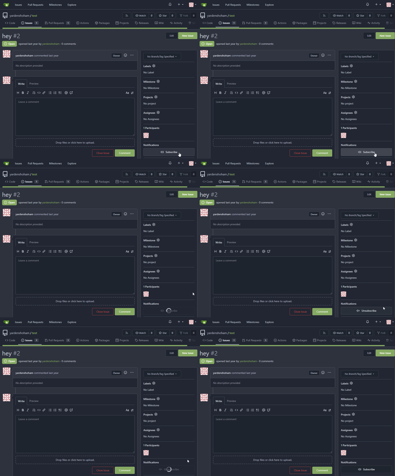
## Don't do a full page load when clicking the subscribe button
- Refactor the form around the subscribe button into its own template
- Use htmx to perform the form submission
- `hx-boost="true"` to prevent the default form submission behavior of a
full page load
- `hx-sync="this:replace"` to replace the current request (in case the
button is clicked again before the response is returned)
- `hx-target="this"` to replace the form tag with the new form tag
- Change the backend response to return a `<form>` tag instead of a
redirect to the issue page
### Before

### After
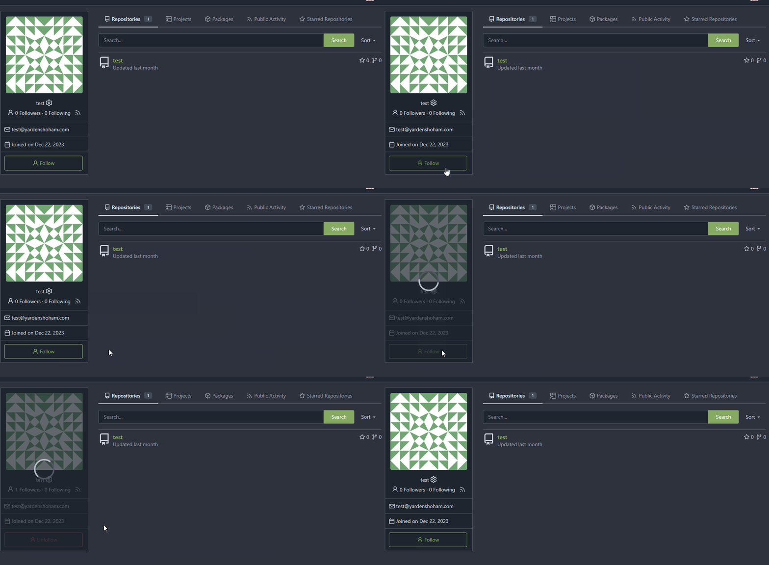
## Don't do a full page load when clicking the follow button
- Use htmx to perform the button request
- `hx-post="{{.ContextUser.HomeLink}}?action=follow"` to send a POST
request to follow the user
- `hx-target="#profile-avatar-card"` to target the card div for
replacement
- `hx-indicator="#profile-avatar-card"` to place the loading indicator
on the card
- Change the backend response to return a `<div>` tag (the card) instead
of a redirect to the user page
### Before

### After
---------
Signed-off-by: Yarden Shoham <git@yardenshoham.com>
Co-authored-by: 6543 <m.huber@kithara.com>
Co-authored-by: Giteabot <teabot@gitea.io>
2024-01-30 15:45:54 +01:00
6543
49d7663929
Revert adding htmx until we finaly decide to add it ( #28879 )
2024-01-21 21:42:35 +08:00
Yarden Shoham
1df06e3f39
Don't do a full page load when clicking the follow button ( #28872 )
...
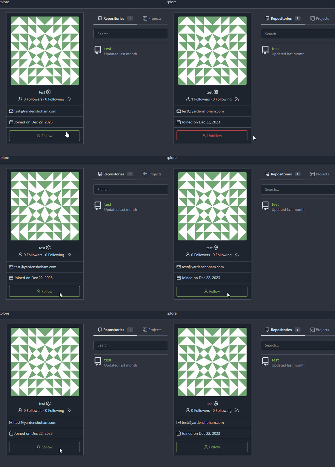
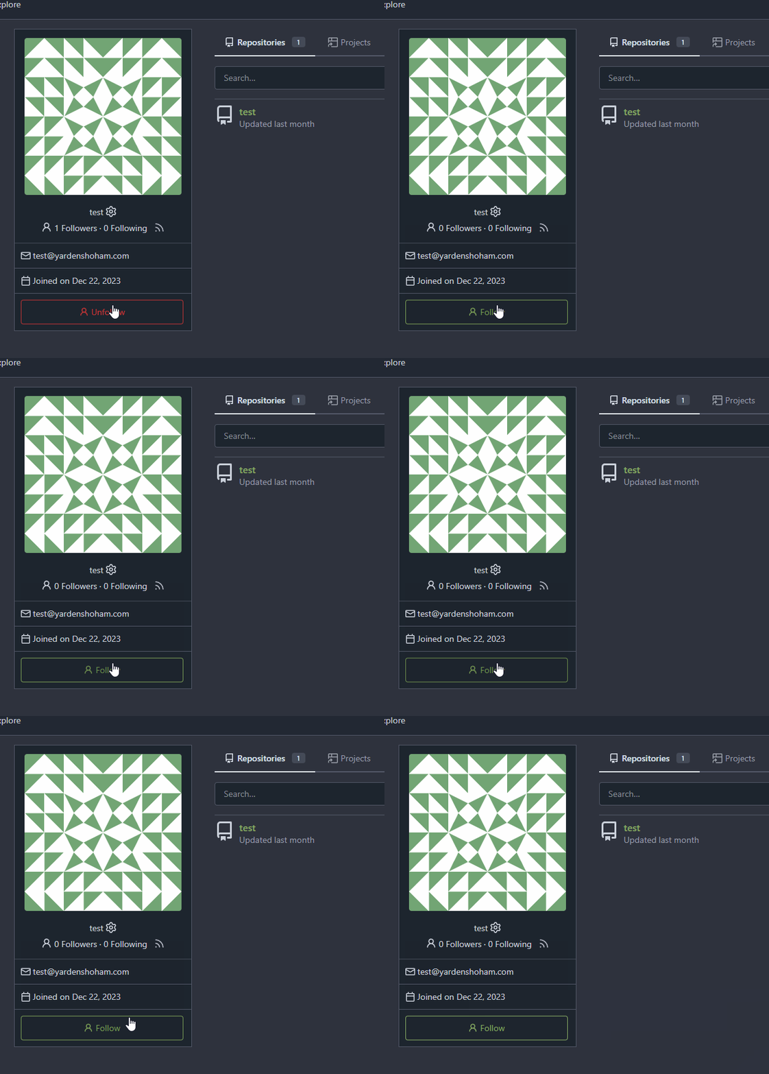
- Use htmx to perform the button request
- `hx-headers='{"x-csrf-token": "{{.CsrfToken}}"}'` to authenticate (we
should probably learn to reuse this)
- `hx-post="{{.ContextUser.HomeLink}}?action=follow"` to send a POST
request to follow the user
- `hx-target="#profile-avatar-card"` to target the card div for
replacement
- `hx-swap="outerHTML"` to replace the card (as opposed to its inner
content) with the new card that shows the new follower count and button
color
- Change the backend response to return a `<div>` tag (the card) instead
of a redirect to the user page
# Before
# After
Signed-off-by: Yarden Shoham <git@yardenshoham.com>
2024-01-20 23:37:22 +01:00
wackbyte
361839fb1c
Fix tooltip of variable edit button ( #28681 )
...
The `variables.edit` key does not exist.

2024-01-03 06:25:19 +00:00
wxiaoguang
e743570f65
Refactor timeutil package ( #28623 )
...
1. make names more readable
2. remove unused FormatLong/FormatShort
3. use `FormatDate` instead of `Format "2006-01-02"`
2023-12-28 10:09:57 +00:00
Yarden Shoham
d9ed931c4d
Fix wrong due date rendering in issue list page ( #28588 )
...
It included the hours, minutes, and seconds. By removing these, the date
renders correctly.

Signed-off-by: Yarden Shoham <git@yardenshoham.com>
2023-12-22 10:53:12 -06:00
KN4CK3R
b3c258828f
Refactor template empty checks ( #28351 )
2023-12-04 15:48:42 -06:00
yp05327
eae555ff23
Remove autofocus in search box ( #28033 )
...
Mentioned here:
https://github.com/go-gitea/gitea/pull/27982#issuecomment-1807923026
2023-11-20 08:57:46 +00:00
yp05327
dcb648ee71
Add Hide/Show all checks button to commit status check ( #26284 )
...
Step one for a GitHub like commit status check ui:


Step two:


The design now will list all commit status checks which takes too much
space.
This is a pre-improve for #26247
---------
Co-authored-by: delvh <dev.lh@web.de>
Co-authored-by: silverwind <me@silverwind.io>
Co-authored-by: wxiaoguang <wxiaoguang@gmail.com>
2023-11-02 14:49:02 +00:00
Denys Konovalov
e5f19dd317
Always use whole user name as link ( #27815 )
...
Starting from #25790 this shared template only linked the username of
the user if both display name and username were shown. I experienced
myself always trying to click on the display name - I think it is
annoying for others too.
After:


2023-10-30 09:53:16 +00:00
yp05327
f39256f035
Add word-break to organization name and description ( #26624 )
...
Fix #24318
Before:


After:


2023-10-25 10:40:39 +00:00
JakobDev
ebe803e514
Penultimate round of db.DefaultContext refactor ( #27414 )
...
Part of #27065

---------

Co-authored-by: Lunny Xiao <xiaolunwen@gmail.com>
2023-10-11 04:24:07 +00:00
techknowlogick
e96e440b8b
add a shortcut to user's profile page to admin user details ( #27299 )
2023-10-08 02:48:32 +00:00
delvh
112f37c546
Fix yet another ctx template bug ( #27417 )
...
Fixes #27416
2023-10-04 02:11:01 +00:00
JakobDev
cc5df26680
Even more db.DefaultContext refactor ( #27352 )
...
Part of #27065

---------

Co-authored-by: Lunny Xiao <xiaolunwen@gmail.com>
Co-authored-by: delvh <dev.lh@web.de>
2023-10-03 10:30:41 +00:00
puni9869
50070550a8
Hide archived labels when filtering by labels on the issue list ( #27115 )
...
Followup https://github.com/go-gitea/gitea/pull/26820
## Archived labels UI for issue filter and issue filter actions for
issues/pull request pages.
Changed:
* Enhanced the Issue filter and Issue filter actions UI page to
seamlessly incorporate a list of archived labels.
* Pagination functionality is same as before. If archived label checkbox
is checked then we are adding a query string`archived=true` in the url
to save the state of page.
* Issue filter actions menu is separated into different template.
* Adding the archived flag in issue url labels.
* Pull Request page is also work the same.
Outsourced:
* Defer the implementation of specialized handling for archived labels
to upcoming pull requests. This step will be undertaken subsequent to
the successful merge of this pull request.
Screenshots
### Issue page
<img width="1360" alt="image"
src="https://github.com/go-gitea/gitea/assets/80308335/d7efb2ef-5b2b-449d-83f0-d430a32ec432 ">
### Issue page with label filter on archived label checkbox when not
checked --> No archived label is there in list
<img width="1249" alt="image"
src="https://github.com/go-gitea/gitea/assets/80308335/ceea68ef-91f2-4693-910f-2e25e236bfc9 ">
### Issue page with label filter on archived label checkbox when checked
--> Show archived label in the list.
<img width="710" alt="image"
src="https://github.com/go-gitea/gitea/assets/80308335/2414d26b-2079-4c3c-bd9e-f2f5411bcabf ">
### Issue page with label filter on issue action menu on archived label
checkbox when checked --> Show archived label in the list.
<img width="409" alt="image"
src="https://github.com/go-gitea/gitea/assets/80308335/259cac87-3e21-4778-99a2-a6a0b8c81178 ">
### Applied the archived=true in Issue labels when archived checkbox is
checked.
<img width="984" alt="image"
src="https://github.com/go-gitea/gitea/assets/80308335/657ce3db-c0ae-402e-b12d-3b580d3c2ed0 ">
---
Part of https://github.com/go-gitea/gitea/issues/25237
---------
Signed-off-by: puni9869 <punitinani1@hotmail.com>
Co-authored-by: delvh <dev.lh@web.de>
Co-authored-by: Giteabot <teabot@gitea.io>
2023-10-01 09:04:39 -04:00
JakobDev
cf0df023be
More db.DefaultContext refactor ( #27265 )
...
Part of #27065

This PR touches functions used in templates. As templates are not static
typed, errors are harder to find, but I hope I catch it all. I think
some tests from other persons do not hurt.
2023-09-29 12:12:54 +00:00
wxiaoguang
93bd4351bf
Fix more "locale" usages ( #27259 )
2023-09-25 20:42:40 +08:00
delvh
7960ba7e2b
Always use ctx.Locale.Tr inside templates ( #27231 )
2023-09-25 08:56:50 +00:00
Denys Konovalov
2325fe777d
cleanup locale function usage ( #27227 )
2023-09-24 20:31:58 +00:00
Denys Konovalov
63b25e816d
fix issues on action runners page ( #27226 )
...
- switch from some weird status badge to label
- translate untranslated `Reset registration token` string
- change documentation link from act_runner README to Gitea Docs site
- fix "No runners available" message width
- use `ctx.Locale.Tr` where possible

2023-09-24 14:12:21 -04:00
Nanguan Lin
218e719ea8
Fix the variable regexp pattern on web page ( #27161 )
...
same as (https://github.com/go-gitea/gitea/pull/26910 )
2023-09-21 09:03:13 +00:00
silverwind
8099238618
Change green buttons to primary color ( #27099 )
...
I think it's better if the primary actions have primary color instead of
green which fits better into the overall single-color UI design. This PR
currently replaces every green button with primary:
<img width="141" alt="Screenshot 2023-09-16 at 14 07 59"
src="https://github.com/go-gitea/gitea/assets/115237/843c1e50-4fb2-4ec6-84ba-0efb9472dcbe ">
<img width="161" alt="Screenshot 2023-09-16 at 14 07 51"
src="https://github.com/go-gitea/gitea/assets/115237/9442195a-a3b2-4a42-b262-8377d6f5c0d1 ">
Modal actions now use uncolored/primary instead of previous green/red
colors. I also removed the box-shadow on all basic buttons:
<img width="259" alt="Screenshot 2023-09-16 at 14 16 39"
src="https://github.com/go-gitea/gitea/assets/115237/5beea529-127a-44b0-8d4c-afa7b034a490 ">
<img width="261" alt="Screenshot 2023-09-16 at 14 17 42"
src="https://github.com/go-gitea/gitea/assets/115237/4757f7b2-4d46-49bc-a797-38bb28437b88 ">
The change currently includes the "Merge PR" button, for which we might
want to make an exception to match the icon color there:
<img width="442" alt="Screenshot 2023-09-16 at 14 33 53"
src="https://github.com/go-gitea/gitea/assets/115237/993ac1a5-c94d-4895-b76c-0d872181a70b ">
2023-09-18 22:05:31 +00:00
jladbrook
e33f112e01
resolve issue with sort icons on admin/users and admin/runners ( #24360 )
...
Fixes #24327 to avoid the sort icon changing the table header over
multiple lines and adds missing sort icons on the runners page.
2023-09-12 12:26:51 +00:00
wxiaoguang
58abd4f06c
Improve issue list layout ( #26983 )
...
Align everything with a new layout.

* Use "baseline" for some special elements, the "flex-item-icon" is for
the issue list only at the moment and I think it should be general
enough now (but not using "flex-item-leading" anymore in this case).
* Make the labels stretch themselves.
2023-09-09 20:23:57 +08:00
wxiaoguang
ffa4949eaa
Improve flex list UI ( #26970 )
...
1. There is already `gt-ac`, so no need to introduce `flex-item-center`
2. The `flex-item-baseline` and `.flex-item-icon svg { margin-top: 1px
}` seem to be a tricky patch, they don't resolve the root problem, and
still cause misalignment in some cases.
* The root problem is: the "icon" needs to align with the sibling
"title"
* So, make the "icon" and the "title" both have the same height
3. `flex-text-inline` could only be used if the element is really
"inline", otherwise its `vertical-align` would make the box size change.
In most cases, `flex-text-block` is good enough.

---------
Co-authored-by: silverwind <me@silverwind.io>
Co-authored-by: Giteabot <teabot@gitea.io>
2023-09-08 13:57:18 +00:00
Nanguan Lin
01e71e2a47
Fix the secret regexp pattern on web page ( #26910 )
...
The error is caused by the web page not handling the post form
failure, which is 400 bad requests in this case.
2023-09-05 20:15:19 +00:00
BeYonme
918accaafa
Relocate the RSS user feed button ( #26882 )
...
before:

after:

Co-authored-by: KN4CK3R <admin@oldschoolhack.me>
2023-09-03 11:06:59 +00:00
silverwind
9b76df53dc
Minor dashboard tweaks, fix flex-list margins ( #26829 )
...
Some small dashboard tweaks:
- Remove margin-bottom from divider so first item does not appear to
have un-equal margins
- Restore previous icon color
- Add slight margin-right to icon
Before:
<img width="783" alt="Screenshot 2023-08-31 at 00 10 28"
src="https://github.com/go-gitea/gitea/assets/115237/b75f70d7-8704-4afb-866d-fea0484c52d4 ">
After:
<img width="783" alt="Screenshot 2023-08-31 at 00 10 08"
src="https://github.com/go-gitea/gitea/assets/115237/50ed0c47-6f7c-449e-a054-13091369d43f ">
---------
Co-authored-by: wxiaoguang <wxiaoguang@gmail.com>
2023-08-31 21:28:45 +00:00
yp05327
bc930f332f
Fix typo of RunerOwnerID ( #26508 )
2023-08-15 23:10:40 +00:00
Panagiotis "Ivory" Vasilopoulos
73f6535406
Fix URL of padlock icon in profile ( #26446 )
2023-08-11 17:40:38 +00:00
wxiaoguang
a370efc13f
Use template context function for avatar rendering ( #26385 )
...
Introduce `AvatarUtils`, no need to pass `$.Context` to every
sub-template, and simplify the template helper functions.
2023-08-10 11:19:39 +08:00
Denys Konovalov
b9baed2c74
Introduce flex-list & flex-item elements for Gitea UI ( #25790 )
...
This PR introduces a new UI element type for Gitea called `flex-item`.
It consists of a horizontal card with a leading, main and trailing part:

The idea behind it is that in Gitea UI, we have many cases where we use
this kind of layout, but it is achieved in many different ways:
- grid layout
- `.ui.list` with additional hacky flexbox
- `.ui.key.list` - looks to me like a style set originally created for
ssh/gpg key list, was used in many other places
- `.issue.list` - created for issue cards, used in many other places
- ...
This new style is based on `.issue.list`, specifically the refactoring
of it done in #25750 .
In this PR, the new element is introduced and lots of templates are
being refactored to use that style. This allows to remove a lot of
page-specific css, makes many of the elements responsive or simply
provides a cleaner/better-looking way to present information.
A devtest section with the new style is also available.
<details>
<summary>Screenshots (left: before, right: after)</summary>


</details>
---------
Co-authored-by: Giteabot <teabot@gitea.io>
2023-08-01 00:13:42 +02:00
Panagiotis "Ivory" Vasilopoulos
d58c542579
Add 'Show on a map' button to Location in profile, fix layout ( #26214 )
...
Not too important, but I think that it'd be a pretty neat touch.

Also fixes some layout bugs introduced by a previous PR.

---------

Co-authored-by: Gusted <postmaster@gusted.xyz>
Co-authored-by: Caesar Schinas <caesar@caesarschinas.com>
Co-authored-by: wxiaoguang <wxiaoguang@gmail.com>
2023-07-31 08:44:45 +00:00
silverwind
72363be7ca
Use shared template for webhook icons ( #26242 )
...
Fixes: https://github.com/go-gitea/gitea/issues/26241
2023-07-31 08:00:52 +00:00
silverwind
aa723dea9b
Don't autosize textarea in diff view ( #26233 )
...
Resizing the comment editor can be a very expensive operation because it
triggers page reflows, which on large PRs can take upwards of seconds to
complete. Disable this mechanism on the diff page only where we know
that the page can get large.

Fixes https://github.com/go-gitea/gitea/issues/26201 for the textarea
editor.

I don't think this can be fixed for EasyMDE because as far as I can
tell, it exposes no option to disable this resizing.

---------

Co-authored-by: Giteabot <teabot@gitea.io>
2023-07-31 00:11:15 +02:00
Panagiotis "Ivory" Vasilopoulos
1c89f15f42
Use calendar icon for Joined on... in profiles ( #26215 )
2023-07-29 19:34:49 +08:00
Denys Konovalov
be23b73e85
Restructure issue list template, styles ( #25750 )
...
This PR does various modifications on the issue list shared template:
- restructure layout to achieve better responsiveness
- fix various style issues
- restructure styles (better result with less code :)
- remove numerous `gt-*` patches and other unneeded classes -> use
existing css classes
<details>
<summary>Before:</summary>


</details>
<details>
<summary>After:</summary>


</details>
---------
Co-authored-by: silverwind <me@silverwind.io>
2023-07-09 19:38:01 +00:00
wxiaoguang
128d77a3a0
Following up fixes for "Fix inconsistent user profile layout across tabs" ( #25739 )
...
Follow
https://github.com/go-gitea/gitea/pull/25625#issuecomment-1621577816
1. Fix the incorrect "project view" layout
2. Fix the "follow/unfollow" link on "packages" and "projects" tab
Before:

After:
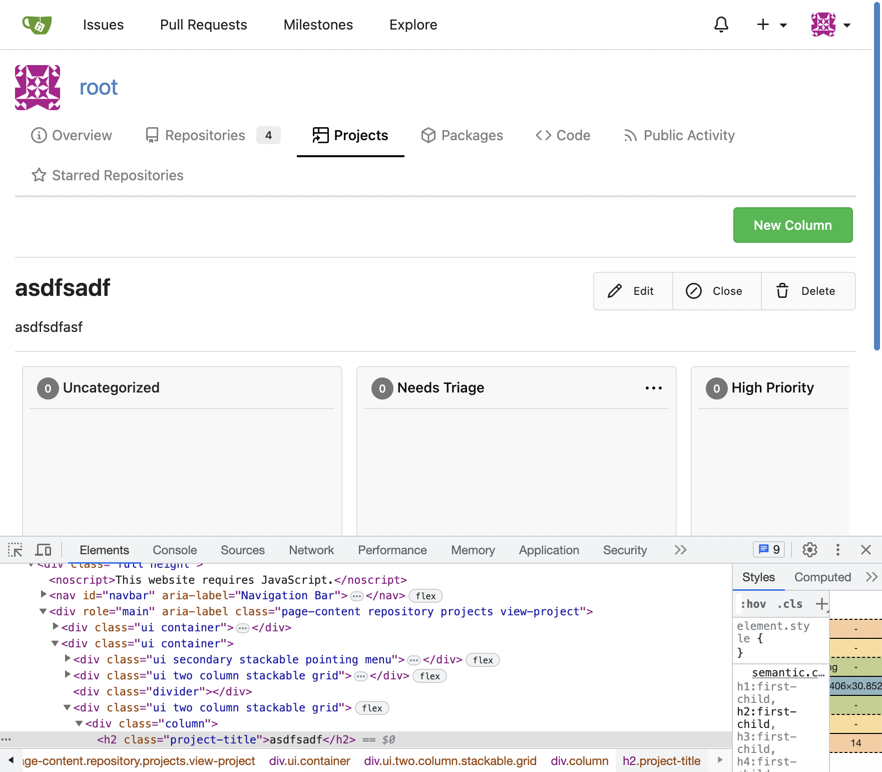
---------
Co-authored-by: Giteabot <teabot@gitea.io>
2023-07-07 17:27:12 +02:00
puni9869
2af30f715e
Fix inconsistent user profile layout across tabs ( #25625 )
...
Fix ::User Profile Page Project Tab Have Inconsistent Layout and Style
Added the big_avator for consistency in the all header_items tabs.
Fixes : #24871
> ### Description
> in the user profile page the `Packages` and `Projects` tab have small
icons for user but other tabs have bigger profile picture with user
info:
>
> ### Screenshots
> ### **For Packages And Projects:**
>

>
> ### **For Other Tabs:**
>

>
## Before

## After changes
Project View
<img width="1394" alt="image"
src="https://github.com/go-gitea/gitea/assets/80308335/95d181d7-8e61-496d-9899-7b825c91ad56 ">
Packages View
<img width="1378" alt="image"
src="https://github.com/go-gitea/gitea/assets/80308335/7f5fd60f-6b18-4fa8-8c56-7b0d45d1a610 ">
## Org view for projects page
<img width="1385" alt="image"
src="https://github.com/go-gitea/gitea/assets/80308335/6400dc89-a5ae-4f0a-831b-5b6efa020d89 ">
## Org view for packages page
<img width="1387" alt="image"
src="https://github.com/go-gitea/gitea/assets/80308335/4e1e9ffe-1e4b-4334-8657-de11b5fd31d0 ">
---------
Co-authored-by: wxiaoguang <wxiaoguang@gmail.com>
Co-authored-by: Giteabot <teabot@gitea.io>
Co-authored-by: silverwind <me@silverwind.io>
2023-07-06 18:59:24 +00:00
Denys Konovalov
00dbba7f42
Several fixes for mobile UI ( #25634 )
...
Resolves #25622
<details>
<summary>Screenshots</summary>


</details>
---------
Co-authored-by: wxiaoguang <wxiaoguang@gmail.com>
Co-authored-by: silverwind <me@silverwind.io>
2023-07-04 17:45:45 +00:00
silverwind
0006169f38
Actions list enhancements ( #25601 )
...
Various small enhancements to the actions list. Before and after:
<img width="1264" alt="Screenshot 2023-06-30 at 00 11 40"
src="https://github.com/go-gitea/gitea/assets/115237/bb4162ee-cdcf-4a73-b05e-f9521562edbb ">
<img width="1264" alt="Screenshot 2023-06-30 at 00 09 51"
src="https://github.com/go-gitea/gitea/assets/115237/52a70ea9-4bb3-406e-904b-0fdaafde9582 ">
---------
Co-authored-by: Giteabot <teabot@gitea.io>
2023-07-04 09:59:47 +00:00
derelm
5b79eeabd1
use css on labels ( #25626 )
...
Changes html to use CSS label class similar to
`templates/shared/actions/runner_list.tmpl`
2023-07-03 02:33:28 +00:00
silverwind
64f2d70262
Replace fomantic divider module with our own ( #25539 )
...
Should look exactly like before for normal dividers. "Horizontal" ones
look better because they no longer use image backgrounds.
<img width="917" alt="Screenshot 2023-06-27 at 19 07 56"
src="https://github.com/go-gitea/gitea/assets/115237/d97d8dec-6859-44a8-85ba-e4549b4dd9df ">
<img width="914" alt="Screenshot 2023-06-27 at 19 05 58"
src="https://github.com/go-gitea/gitea/assets/115237/8bf98544-2d82-4ebf-ac68-d6dc237bd6b2 ">
<img width="1246" alt="Screenshot 2023-06-27 at 19 00 42"
src="https://github.com/go-gitea/gitea/assets/115237/36a6bb21-6029-4f53-8bee-535f55c66fed ">
<img width="344" alt="Screenshot 2023-06-27 at 18 58 15"
src="https://github.com/go-gitea/gitea/assets/115237/a9e70aee-8e6b-4ea1-9e93-19c9f96aec6e ">
<img width="823" alt="Screenshot 2023-06-27 at 18 56 22"
src="https://github.com/go-gitea/gitea/assets/115237/e7a497cd-f262-4683-8872-23c3c8cce32f ">
<img width="330" alt="Screenshot 2023-06-27 at 19 21 11"
src="https://github.com/go-gitea/gitea/assets/115237/42f24149-a655-4c7e-bd26-8ab52db6446b ">
2023-06-29 20:24:22 +08:00
silverwind
af094fbb6c
Introduce shared template for search inputs ( #25338 )
...
- Set
[type=search](https://developer.mozilla.org/en-US/docs/Web/HTML/Element/input/search )
- Disable spellcheck
- Set maxLength 255 that I found in `templates/repo/issue/search.tmpl`
- Remove unnecessary `max-width`, it does nothing
---------
Co-authored-by: delvh <dev.lh@web.de>
Co-authored-by: Giteabot <teabot@gitea.io>
2023-06-22 10:27:35 +00:00