- Switched to plain JavaScript
- Tested the webhook editing functionality and it works as before
# Demo using JavaScript without jQuery

---------
Signed-off-by: Yarden Shoham <git@yardenshoham.com>
Co-authored-by: wxiaoguang <wxiaoguang@gmail.com>
- Switched to plain JavaScript
- Tested the organization rename prompt toggling functionality and it
works as before
# Demo using JavaScript without jQuery

---------
Signed-off-by: Yarden Shoham <git@yardenshoham.com>
Co-authored-by: silverwind <me@silverwind.io>
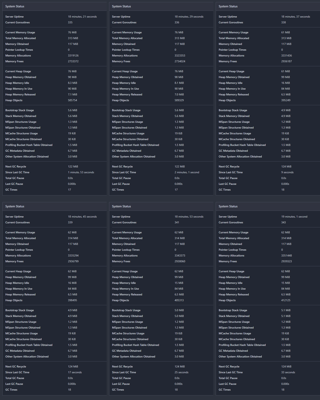
- Refactor the system status list into its own template
- Change the backend to return only the system status if htmx initiated
the request
- `hx-get="{{$.Link}}/system_status`: reuse the backend handler
- `hx-swap="innerHTML"`: replace the `<div>`'s innerHTML (essentially
the new template)
- `hx-trigger="every 5s"`: call every 5 seconds
- `hx-indicator=".divider"`: the `is-loading` class shouldn't be added
to the div during the request, so set it on an element it has no effect
on
- Render "Since Last GC Time" with `<relative-time>`, so we send a
timestamp
# Auto-update in action GIF

---------
Signed-off-by: Yarden Shoham <git@yardenshoham.com>
Co-authored-by: silverwind <me@silverwind.io>
Continuation of https://github.com/go-gitea/gitea/pull/25439. Fixes#847
Before:
<img width="1296" alt="image"
src="https://github.com/go-gitea/gitea/assets/32161460/24571ac8-b254-43c9-b178-97340f0dc8a9">
----
After:
<img width="1296" alt="image"
src="https://github.com/go-gitea/gitea/assets/32161460/c60b2459-9d10-4d42-8d83-d5ef0f45bf94">
---
#### Overview
This is the implementation of a requested feature: Contributors graph
(#847)
It makes Activity page a multi-tab page and adds a new tab called
Contributors. Contributors tab shows the contribution graphs over time
since the repository existed. It also shows per user contribution graphs
for top 100 contributors. Top 100 is calculated based on the selected
contribution type (commits, additions or deletions).
---
#### Demo
(The demo is a bit old but still a good example to show off the main
features)
<video src="https://github.com/go-gitea/gitea/assets/32161460/9f68103f-8145-4cc2-94bc-5546daae7014" controls width="320" height="240">
<a href="https://github.com/go-gitea/gitea/assets/32161460/9f68103f-8145-4cc2-94bc-5546daae7014">Download</a>
</video>
#### Features:
- Select contribution type (commits, additions or deletions)
- See overall and per user contribution graphs for the selected
contribution type
- Zoom and pan on graphs to see them in detail
- See top 100 contributors based on the selected contribution type and
selected time range
- Go directly to users' profile by clicking their name if they are
registered gitea users
- Cache the results so that when the same repository is visited again
fetching data will be faster
---------
Co-authored-by: silverwind <me@silverwind.io>
Co-authored-by: hiifong <i@hiif.ong>
Co-authored-by: delvh <dev.lh@web.de>
Co-authored-by: 6543 <6543@obermui.de>
Co-authored-by: yp05327 <576951401@qq.com>
- Switched to plain JavaScript
- Tested the task list functionality and it works as before

---------

Signed-off-by: Yarden Shoham <git@yardenshoham.com>
Co-authored-by: wxiaoguang <wxiaoguang@gmail.com>
Co-authored-by: Giteabot <teabot@gitea.io>
Co-authored-by: silverwind <me@silverwind.io>
- Switched to plain JavaScript
- Tested the form and it works as before

---------

Signed-off-by: Yarden Shoham <git@yardenshoham.com>
Co-authored-by: wxiaoguang <wxiaoguang@gmail.com>
I'm using this convention in other projects and I think it makes sense
for gitea too because the vitest setup file is loaded globally for all
tests, not just ones in web_src, so it makes sense to be in the root.
When setting `url.host` on a URL object with no port specified (like is
the case of default port), the resulting URL's port will not change.
Workaround this quirk in the URL standard by explicitely setting port
for the http and https protocols.

Extracted the logic to a function for the purpose of testing. Initially
I wanted to have the function in utils.js, but it turns out esbuild can
not treeshake the unused functions which would result in the
webcomponents chunk having all 2kB utils.js inlined, so it seemed not
worth.

Fixes: https://github.com/go-gitea/gitea/issues/29084
Behaviour now matches GH. Safeguard added in the for loop because
`textContent` may be null in which case it does not make sense to render
the copy button.
- Closes https://github.com/go-gitea/gitea/issues/28880
This change introduces htmx with the hope we could use it to make Gitea
more reactive while keeping our "HTML rendered on the server" approach.
- Add `htmx.js` that imports `htmx.org` and initializes error toasts
- Place `hx-headers='{"x-csrf-token": "{{.CsrfToken}}"}'` on the
`<body>` tag so every request that htmx sends is authenticated
- Place `hx-swap="outerHTML"` on the `<body>` tag so the response of
each htmx request replaces the tag it targets (as opposed to its inner
content)
- Place `hx-push-url="false"` on the `<body>` tag so no changes to the
URL happen in `<form>` tags
- Add the `is-loading` class during request
### Error toasts in action

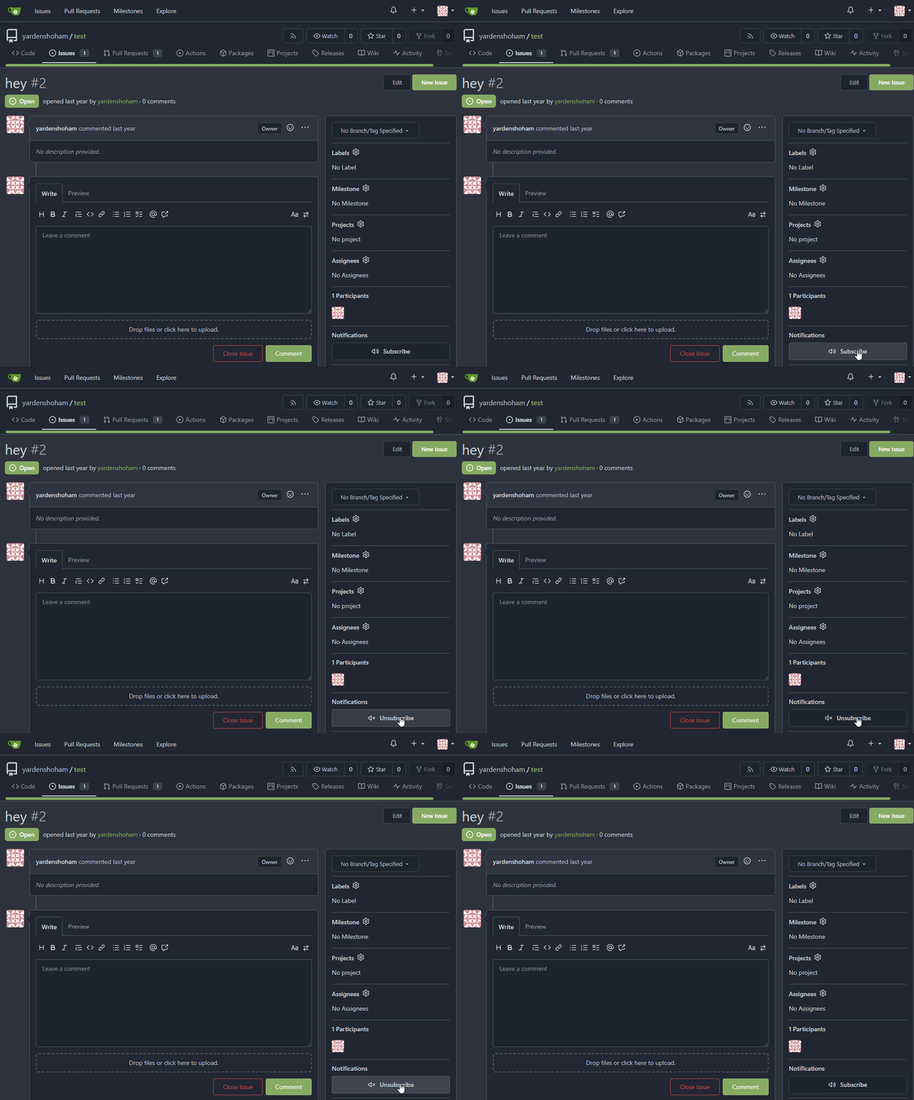
## Don't do a full page load when clicking the subscribe button
- Refactor the form around the subscribe button into its own template
- Use htmx to perform the form submission
- `hx-boost="true"` to prevent the default form submission behavior of a
full page load
- `hx-sync="this:replace"` to replace the current request (in case the
button is clicked again before the response is returned)
- `hx-target="this"` to replace the form tag with the new form tag
- Change the backend response to return a `<form>` tag instead of a
redirect to the issue page
### Before

### After

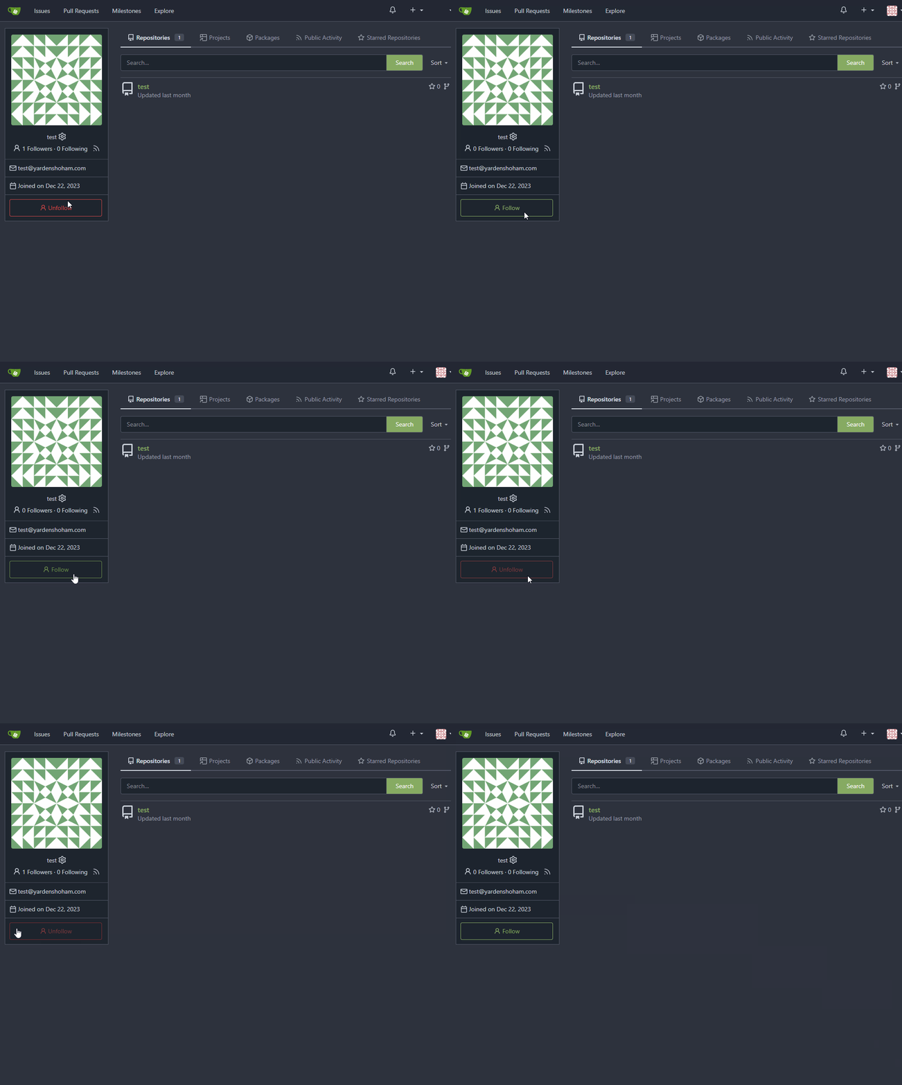
## Don't do a full page load when clicking the follow button
- Use htmx to perform the button request
- `hx-post="{{.ContextUser.HomeLink}}?action=follow"` to send a POST
request to follow the user
- `hx-target="#profile-avatar-card"` to target the card div for
replacement
- `hx-indicator="#profile-avatar-card"` to place the loading indicator
on the card
- Change the backend response to return a `<div>` tag (the card) instead
of a redirect to the user page
### Before

### After

---------
Signed-off-by: Yarden Shoham <git@yardenshoham.com>
Co-authored-by: 6543 <m.huber@kithara.com>
Co-authored-by: Giteabot <teabot@gitea.io>
The `ToUTF8*` functions were stripping BOM, while BOM is actually valid
in UTF8, so the stripping must be optional depending on use case. This
does:

- Add a options struct to all `ToUTF8*` functions, that by default will
strip BOM to preserve existing behaviour
- Remove `ToUTF8` function, it was dead code
- Rename `ToUTF8WithErr` to `ToUTF8`
- Preserve BOM in Monaco Editor
- Remove a unnecessary newline in the textarea value. Browsers did
ignore it, it seems but it's better not to rely on this behaviour.

Fixes: https://github.com/go-gitea/gitea/issues/28743
Related: https://github.com/go-gitea/gitea/issues/6716 which seems to
have once introduced a mechanism that strips and re-adds the BOM, but
from what I can tell, this mechanism was removed at some point after
that PR.
Gitea treat JS errors seriously, so sometimes the JS errors caused by
3rdparty code (eg: browser extensions) would also be reported on Gitea
UI: TypeError: WeakMap key undefined (caused by extension DarkReader's
bug) #28861

To avoid fill the user's screen with a lot of error messages, this PR
merges the same error messages into one, like this:

```js
<div class="page-content">
  <div class="... js-global-error" data-global-error-msg-compact="testmsg1" data-global-error-msg-count="2">test msg 1 (2)</div>
  <div class="... js-global-error" data-global-error-msg-compact="testmsg2" data-global-error-msg-count="1">test msg 2</div>
</div>
```
- Refactor the form around the subscribe button into its own template
- Use htmx to perform the form submission
- `hx-boost="true"` to prevent the default form submission behavior of a
full page load
- `hx-sync="this:replace"` to replace the current request (in case the
button is clicked again before the response is returned)
- `hx-target="this"` to replace the form tag with the new form tag
- `hx-push-url="false"` to disable a change to the URL
- `hx-swap="show:no-scroll"` to preserve the scroll position
- Change the backend response to return a `<form>` tag instead of a
redirect to the issue page
- Include `htmx.org` in javascript imports
This change introduces htmx with the hope we could use it to make Gitea
more reactive while keeping our "HTML rendered on the server" approach.
# Before

# After

---------
Signed-off-by: Yarden Shoham <git@yardenshoham.com>
Fixes#27114.
* In Gitea 1.12 (#9532), a "dismiss stale approvals" branch protection
setting was introduced, for ignoring stale reviews when verifying the
approval count of a pull request.
* In Gitea 1.14 (#12674), the "dismiss review" feature was added.
* This caused confusion with users (#25858), as "dismiss" now means 2
different things.
* In Gitea 1.20 (#25882), the behavior of the "dismiss stale approvals"
branch protection was modified to actually dismiss the stale review.
For some users this new behavior of dismissing the stale reviews is not
desirable.
So this PR reintroduces the old behavior as a new "ignore stale
approvals" branch protection setting.
---------
Co-authored-by: delvh <dev.lh@web.de>
- Make use of the `form-fetch-action` for the merge button, which will
automatically prevent the action from happening multiple times and show
a nice loading indicator as user feedback while the merge request is
being processed by the server.
- Adjust the merge PR code to JSON response as this is required for the
`form-fetch-action` functionality.
- Resolves https://codeberg.org/forgejo/forgejo/issues/774
- Likely resolves the cause of
https://codeberg.org/forgejo/forgejo/issues/1688#issuecomment-1313044

(cherry picked from commit 4ec64c19507caefff7ddaad722b1b5792b97cc5a)

Co-authored-by: Gusted <postmaster@gusted.xyz>
Gitea prefers to use relative URLs in code (to make multiple domain work
for some users)

So it needs to use `toAbsoluteUrl` to generate a full URL when click
"Reference in New Issues"

And add some comments in the test code
In the commit 5a56f9699c (3.) the min-height was applied to all wiki
elements. This resulted in huge blank spaces when viewing the wiki.

This fixes this by only applying the min-height to the preview when
editing.

Refs: https://codeberg.org/forgejo/forgejo/pulls/2080

(cherry picked from commit 8f0baefe5dadc929fe7456c36c8b205e96f228f0)

Co-authored-by: Fl1tzi <git@fl1tzi.com>
- When crafting the OAuth2 callbackURL take into account `appSubUrl`,
which is quite safe given that its strictly formatted.
- No integration testing as this is all done in Javascript.
- Resolves https://codeberg.org/forgejo/forgejo/issues/1795

(cherry picked from commit 27cb6b7956136f87aa78067d9adb5a4c4ce28a24)

Co-authored-by: Gusted <postmaster@gusted.xyz>
When the form is going to be submitted, add the "is-loading" class to
show an indicator and avoid user UI events.

When the request finishes (success / error), remove the "is-loading"
class to make user can interact the UI.
To improve maintainability, this PR:

1. Rename `web_src/js/modules/aria` to `web_src/js/modules/fomantic`
(the code there are all for aria of fomantic)
2. Move api/transition related code to
`web_src/js/modules/fomantic/api.js` and
`web_src/js/modules/fomantic/transition.js`

No logic is changed.
* Show checkout instructions also when there is no permission to push,
for anyone who wants to locally test the changes.
* First checkout the branch exactly as is, without immediately having to
solve merge conflicts. Leave this to the merge step, since it's often
convenient to test a change without worrying about this.
* Use `git fetch -u`, so an existing local branch is updated when
re-testing the same pull request. But not the more risky `git fetch -f`
in to handle force pushes, as we don't want to accidentally overwrite
important local changes.
* Show different merge command depending on the chosen merge style,
interactively updated.
When hitting the `enter` key to create a new project column, the request
is sent twice because the `submit` event and `key up` event are both
triggered.
Probably a better solution is to rewrite these parts of the code to
avoid using native jQuery but reuse the `form-fetch-action` class. But
it's beyond my ability.
1. Do not show temporary tooltips that are triggered from within
dropdowns. Previously this resulted in the tooltip being stuck to
top-left of the page like seen on issue comment URL copy. I could not
figure out any tippy options that prevent this, so I think it's better
to just not show it.
1. Refactor `initGlobalCopyToClipboardListener` so that it does not run
a often useless `document.querySelector` on every click, make
`data-clipboard-text-type` work with `data-clipboard-target`. No use in
current code base but still good to have. Finally some minor code
cleanup in the function.

Point 1 is for this copy button:

<img width="229" alt="image"
src="https://github.com/go-gitea/gitea/assets/115237/81f34746-8ea5-43d9-8c6f-f6f417a9e4ad">

---------

Co-authored-by: Giteabot <teabot@gitea.io>
1. Dropzone attachment removal, pretty simple replacement
2. Image diff: The previous code fetched every image twice, once via
`img[src]` and once via `$.ajax`. Now it's only fetched once and a
second time only when necessary. The image diff code was partially
rewritten.

---------

Co-authored-by: Giteabot <teabot@gitea.io>
This patch adds a hover background for the wiki row in wiki list page,
which make its behavior more close to repo's file list page.
This patch also make the wiki-git-entry visible on the row is hovered
instead of the cel, so users won't be confused since the 'grid' is not
visible from the web page.
After the patch: (when the wiki named 'Home' is hovered)

- Update all JS and PY dependencies
- Enable eslint `prefer-object-has-own` and autofix issue
- Fix styling on citation buttons
- Tested citation, mermaid, monaco, swagger, katex

Citation button issue was that these buttons were not filled:

<img width="136" alt="Screenshot 2023-10-07 at 14 05 08"
src="https://github.com/go-gitea/gitea/assets/115237/435f0c91-28ac-46b3-bae4-dad768b29c05">

Co-authored-by: techknowlogick <techknowlogick@gitea.com>
Part of https://github.com/go-gitea/gitea/issues/27097:

- `gitea` theme is renamed to `gitea-light`
- `arc-green` theme is renamed to `gitea-dark`
- `auto` theme is renamed to `gitea-auto`

I put both themes in separate CSS files, removing all colors from the
base CSS. Existing users will be migrated to the new theme names. The
dark theme recolor will follow in a separate PR.

## ⚠️ BREAKING ⚠️

1. If there are existing custom themes with the names `gitea-light` or
`gitea-dark`, rename them before this upgrade and update the `theme`
column in the `user` table for each affected user.
2. The theme in `<html>` has moved from `class="theme-name"` to
`data-theme="name"`, existing customizations that depend on should be
updated.

---------

Co-authored-by: Lunny Xiao <xiaolunwen@gmail.com>
Co-authored-by: Giteabot <teabot@gitea.io>
This PR reduces the complexity of the system setting system.

It only needs one line to introduce a new option, and the option can be
used anywhere out-of-box.

It is still high-performant (and more performant) because the config
values are cached in the config system.
Currently, checkboxes are positioned as absolute. This positioning
causes the input to overlay an element that has been floated within the
editor. Floated elements are useful if you want your text to wrap around
this element. This PR fixes the overlaying of checkboxes by removing the
absolute positioning, updating the `ul` padding, and
displaying`.task-list-item` `flex` to ensure inputs and the associated
label are on the same line.

Screenshots:

Before:
<img width="762" alt="Screenshot 2023-09-01 at 3 40 59 PM"
src="https://github.com/go-gitea/gitea/assets/6152817/570247c7-7f5c-4697-bfc9-ad4655e37991">

After:
<img width="762" alt="Screenshot 2023-09-01 at 3 42 20 PM"
src="https://github.com/go-gitea/gitea/assets/6152817/db53df45-1294-4eee-84c0-b21ac4fdf805">

---------

Co-authored-by: rafh <rafaelheard@gmail.com>
The `.new-menu` was using a pseudo-element based fade-out effect.
Replace this with a more modern mask-based effect which in this case
required a child element to avoid fading out the background as well, so
I applied it to child `new-menu-inner` which was present on all these
menus except explore where I added it.

There is no visual difference except that the items on the explore page
have no `gap` between them any longer, making it consistent with other
menus. Before and after:

<img width="221" alt="Screenshot 2023-09-21 at 21 13 19"
src="https://github.com/go-gitea/gitea/assets/115237/b4a38ce2-cee1-4c54-84a5-e1d0bfd79e29">
<img width="222" alt="Screenshot 2023-09-21 at 21 32 36"
src="https://github.com/go-gitea/gitea/assets/115237/bb6b1335-d935-4ad4-bb85-3b0fc3027c2b">

Also, this cleans up the related CSS vars:

- `--color-header-wrapper-transparent` is removed, no longer needed
- `--color-header-wrapper` is defined in base theme as well, was
previously unset and therefor transparent.

[no whitespace
diff](https://github.com/go-gitea/gitea/pull/27181/files?diff=unified&w=1)
[demo of mask fade](https://jsfiddle.net/silverwind/tsfadb3u/)
Fixes https://github.com/go-gitea/gitea/issues/27136.

This does the following for Monaco's EOL setting:

1. Use editorconfig setting if present
2. Use the file's dominant line ending as detected by monaco, which uses
LF for empty file